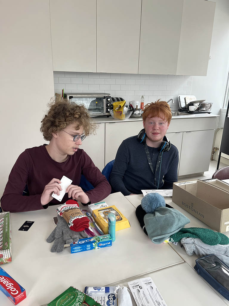
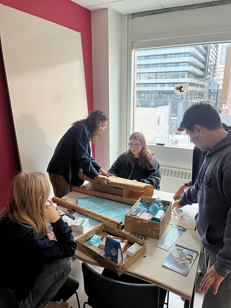
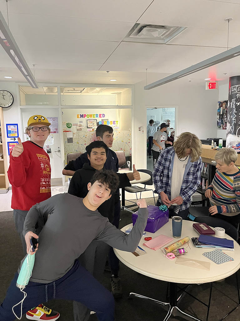
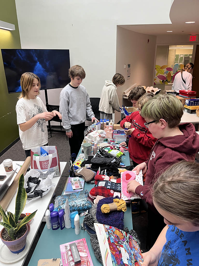
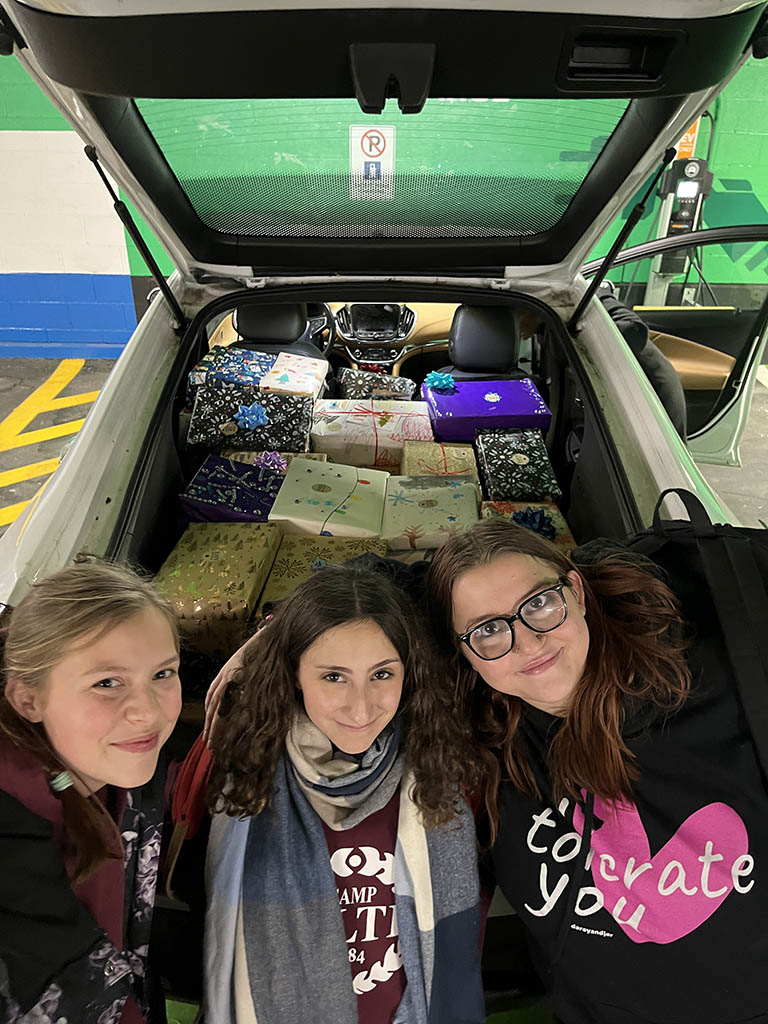
Over the month of November the YMCA Academy embraced the spirit of giving and once again participated in the Shoebox Project for Women. Our community went above and beyond and was able to put together 38 gift-filled shoe boxes this year!
The Shoebox Project for Women operates throughout Canada and the United States, delivering shoebox gifts to women in need. In Toronto the shoeboxes are distributed to women accessing a variety of services such as the YMCA Women’s Shelter, CAMH, Native Women’s Resource Centre, Covenant House etc. The aim of the project is to remind women that they have not been forgotten and that they are a valued and respected member of their community. This initiative aligns with the YMCA core values and provides an opportunity to foster empathy, practice civic engagement and collaborate with peers in a meaningful way.
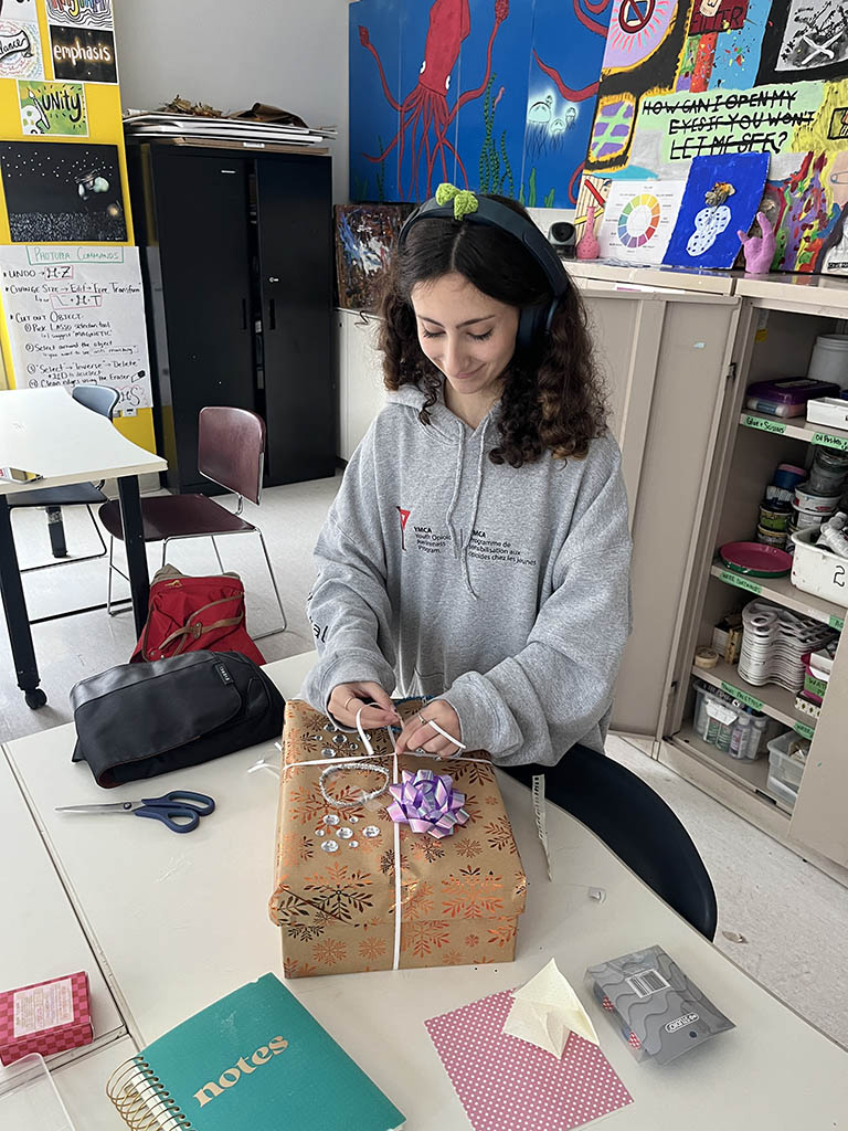
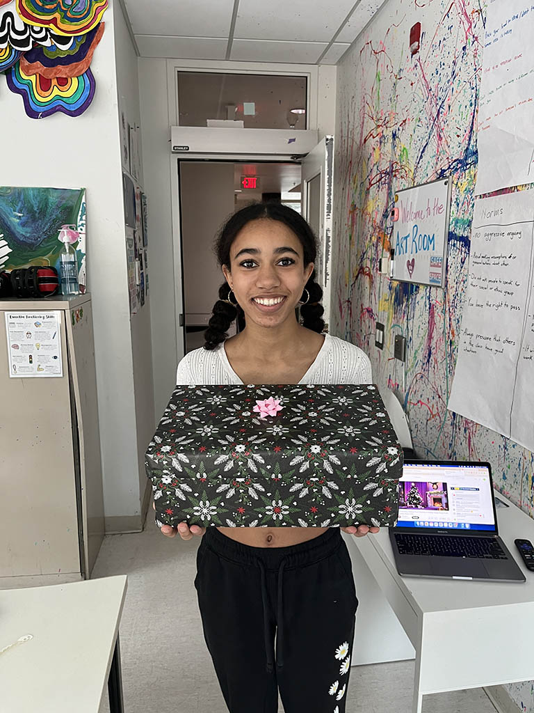
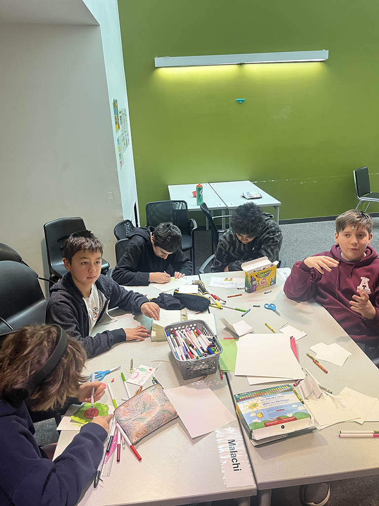
Students attended an assembly to learn about how people, and women in particular, are impacted by homelessness in Toronto and Canada. This helped to put the project into context and to provide students with information about the housing crisis and other issues that Canadians face. In advisory groups, students brainstormed what gifts might help women feel special and devised a plan of who would purchase each item. Then the day came to bring together all the gifts and create the boxes. Each group decorated and filled at least one box and made sure it included everything on the list. Students also wrote thoughtful messages in a card for the recipient. Once all the boxes were ready to go they were taken to a drop off location to be distributed in time for the holidays.
Here is what some of our students had to say about participating in the project:
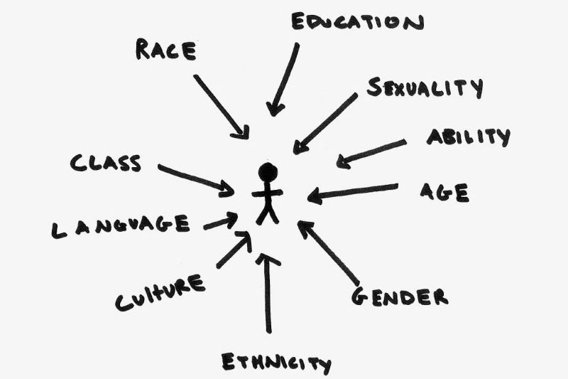
“I really enjoyed the project. It teaches kids about privilege and gives them a better understanding of the world around them.” – Maiko
“It was a relaxing activity to make the boxes while we listened to music and snow was falling.” – Kelly
“It was a great time. I had a lot of fun hanging out with my friends.” – Jack
“We wanted to make the boxes to deliver to women in need who could use the stuff to comfort them.” – Griffin
“‘I felt the shoebox project was a great way to share joy over the holiday season to people who need the support” – Chloe